PROJECT OVERVIEW
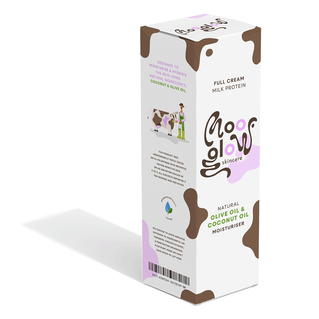
Mooglow is a kind, cruelty-free skincare brand that prides itself on its natural list of ingredients suitable for people of all skin types, sensitivities and conditions. As its formula is made up of organic milk protein, coconut and olive oil, the packaging design and colour palette are intentionally derived from coconuts and the coat of a cow.
STRATEGIC ANALYSIS
A HOLISTIC APPROACH
Together, the following elements and values are meticulously and consistently communicated across all brand identifiers and touch points, forming a guide that influences how Mooglow sounds and feels to its ideal audience and consumers.
This ensures a strong, cohesive brand identity that stands out on market shelves.

ARCHETYPE
The Celestial is pure and simplistic. These brands evoke feelings of nostalgia, joy, and innocence, offering products or services that promise security and ease. They appeal to consumers who long for a carefree and wholesome experience.
MISSION
We want to bring optimism to this area of the skincare industry. This is achieved through the use of cheerful and quirky colours and illustrations, bringing an uplifting visual identity to a brand that is sure to bring positive results to those who use it.
AUDIENCE
Our target client is Gaia who was born with eczema and is tired of her bathroom cabinet looking like a pharmaceutical stall. She is looking to find balance in natural skincare products that also bring delight and ease to her daily regime.
BRAND VOICE
Mooglow uses dry humour and a no-fuss attitude throughout their packaging
and marketing campaigns to maintain a sense of lightness and freedom within
their identity, making them stand out in an industry that can be sterile and serious.


The logo suite for Mooglow features a customised typeface designed to resemble the rich and creamy texture of the moisturising skincare products. This fluidity in its design is a nod towards the ease of use and effectiveness of their formulations. Each letter has been crafted to evoke the smooth consistency of the high-quality creams and lotions, creating an immediate visual connection to the brand’s core product offering, as well as adding fun and character to the brand voice.
LOGO SUITE

PRIMARY

SECONDARY

BRANDMARK
VISUAL IDENTITY
The Celestial brand values authentic and honest communication, so we added custom brand illustrations to enhance the brand’s goal in reflecting the purity and innocence associated with their archetype.
Whimsical character illustrations easily convey a sense of playfulness and childlike wonder, evoking feelings of joy and nostalgia. This positive imagery reinforces the brand’s core values of evoking wholesome and cheerful emotions in its audience.


BROWN SWISS
#7E5E4B
UDDERLY PINK
#F1B1FF


ZEBU
#514034
KALAMATA
#BDC652


MILKSHAKE
#FAE3FF
PASTURE