PROJECT OVERVIEW
Plant.Boyzz is a Gold Coast based plant nursery, workshop and online mentor that goes the extra mile when supplying quirky plants, bespoke terrarium creations and hosting events. Born from a passion for house plants and their care, owners Jose and Matt adopted the slogan “Turning People into Plant Parents” to emphasise the love and attention that our plants need and deserve, providing a unique service that supports their customers.
STRATEGIC ANALYSIS
A HOLISTIC APPROACH
Together, the following elements and values are meticulously and consistently communicated across all brand identifiers and touch points, forming a guide that influences how Plant.Boyzz sounds and feels to its ideal audience and consumers.
This ensures a strong, cohesive brand identity that stands out on market shelves.
ARCHETYPE
The Guardian of the Galaxy is nurturing and seeks to support others. They prioritise empathy and compassion, promising to make the lives of their consumers better and easier by tending to their needs and providing comfort.
MISSION
Plant.Boyzz want to be known for providing a warm and friendly service that goes a step further than the norm with the aftercare of their customers and their products.
AUDIENCE
Working adults on the go who love to adorn their homes with greenery but are hesitant as they don’t believe their busy lifestyles will allow them to keep the plants healthy and happy.
BRAND VOICE
Plant.Boyzz are casual and familiar in their interactions with both their online audience and in-person customers. They prioritise providing warmth, friendliness and a touch of sass, with care and connection at the forefront of their service.
The logo suite for Plant.Boyzz personifies a vibrant playfulness with custom typeface and lettering displayed as cactus illustrations - one of the small business’ best selling products. The quirky elements of the typeface, such as irregular shapes and unexpected curves, set the logo apart from more traditional plant nursery brands. This distinctiveness helps to create a impact, making the brand easily recognisable and more likely to be remembered by their audience.
LOGO SUITE
PRIMARY
SECONDARY
BRANDMARK
VISUAL IDENTITY
BULB
BLOOM
#FFDDFA
#F1B1FF
#4B4B1F
#D8D2D8
SAND
#F0E0C0
DANDELION
#E2AC50
IVY
TERRACOTTA
#7A8D26
#BB6C29
STONE
SOIL
A predominantly rustic colour palette serves as the foundation of the brand identity, reflecting Plant.Boyzz’ deep connection to nature and the earth. This conveys a sense of calmness and authenticity whilst giving a nostalgic and homely feel to the visual identity. Splashes of bold, energetic colours are strategically incorporated to infuse the brand with vibrancy and friendly energy.
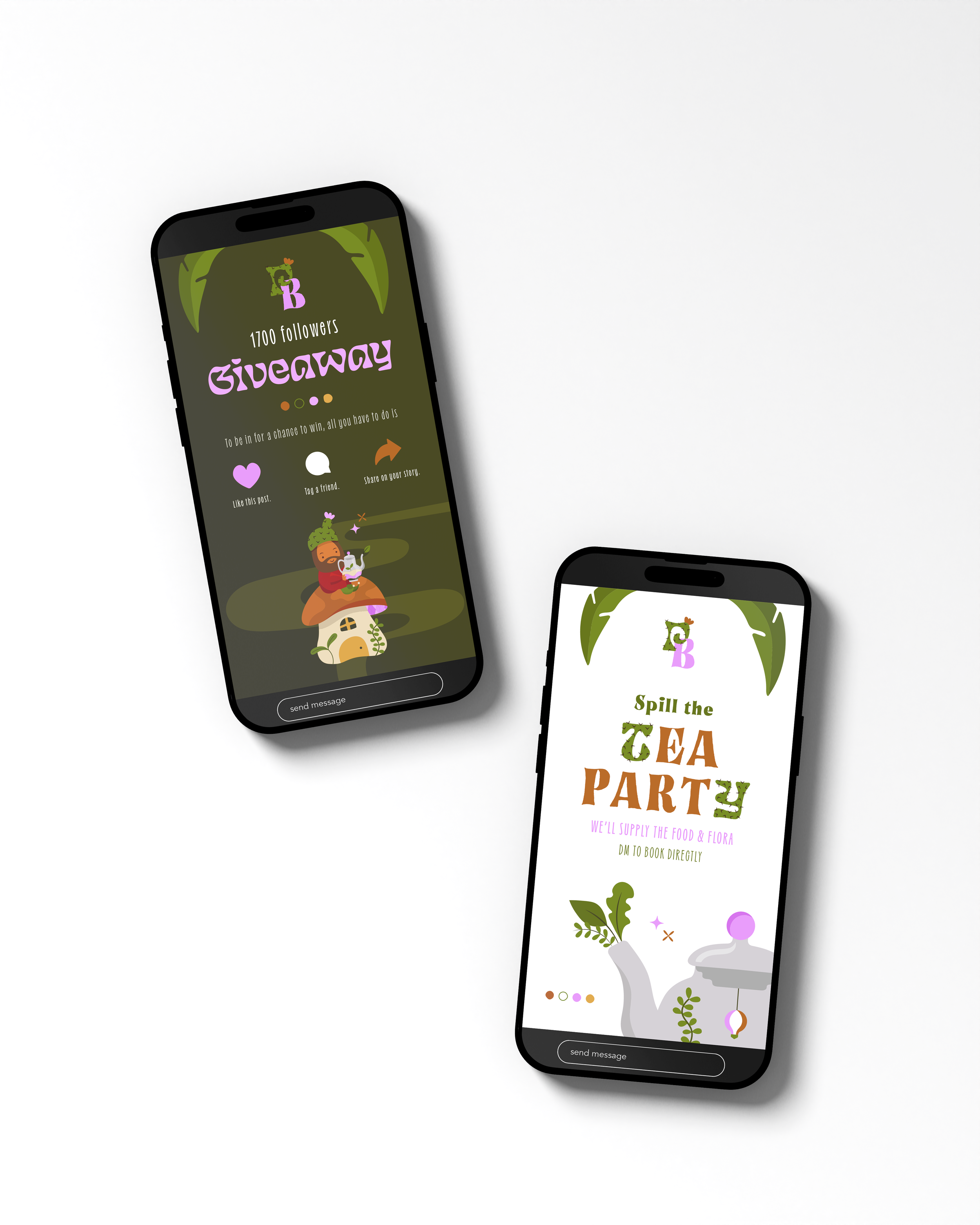
Whimsical and approachable illustrations serve to humanise the brand, creating an emotional connection with the brand audience and reinforcing their role as caretakers of plants, animals and people.
“We are so happy with the results we got from our rebrand project, every time a friend or fellow business owner makes a comment about our new look, I tell them you HAVE to work with Sally!
It’s had a big impact on our business as it’s made us feel more confident and professional and has really grabbed people’s attention. We had some vague ideas of what we wanted going into the project but Sally was able to pull it all together with some amazing advice ad really helped us in realising what we needed in order to grow.”


