PROJECT OVERVIEW
Sonia Makeup is a women-led, holistic beauty brand based in Ireland that orients towards embracing natural beauty, highlighting radiance and bringing out the best in people, both aesthetically and spiritually. The owner, Sonia, aims to change the makeup game by encouraging her clients to feel “Free in your own skin” and creating a compassionate and soulful experience from start to finish.
Sonia wanted her brand identity to embody a mixture of professional luxury with an uplifting bohemian twist.
STRATEGIC ANALYSIS
A HOLISTIC APPROACH
Together, the following elements and values are meticulously and consistently communicated across all brand identifiers and touch points, forming a guide that influences how Sonia Makeup sounds and feels to its ideal audience and consumers.
This ensures a strong, cohesive brand identity that stands out on market shelves.
ARCHETYPE
The North Star is wise and knowledgeable. These brands position themselves as authorities in their field, offering valuable insights and guidance to customers. They prioritise enlightenment and self-improvement, aiming to empower consumers with wisdom.
MISSION
To bring warmth, tranquillity, self worth, acceptance and a sense of belonging to everyone who comes in contact with the beauty brand, with a touch of fun and levity along the way.
AUDIENCE
Women aged 18+ who don’t resonate with the need to cover up their features in order to meet a standard of beauty, but would rather be taught how to embrace what mother nature gave them during their self care practices.
BRAND VOICE
Sonia Makeup is a soft, luxurious, compassionate and optimistic brand that evokes a sense of both unity and inclusivity whilst remaining a trustworthy leader and mentor within their field.
The logo suite for Sonia Makeup personifies professionalism using a luxurious and delicate serif font with custom typeface and splash of fun in the bright and energetic colour palette.
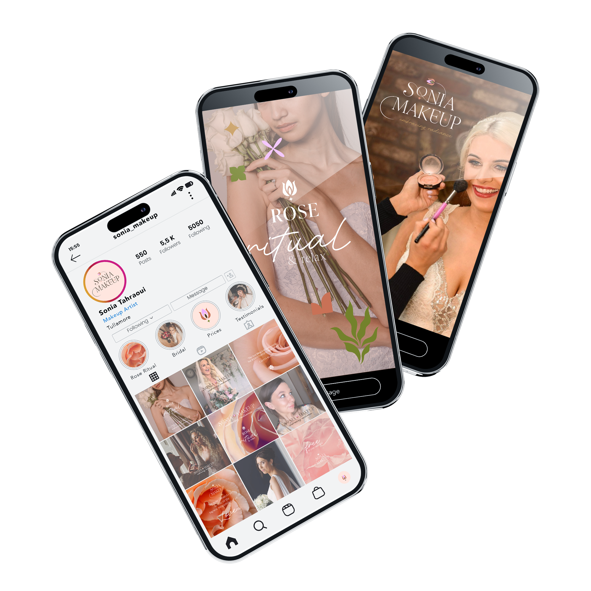
Sonia provides a service called “Rose Ritual & Relax” and wanted the visual of a rose to be at the forefront of the brand identity.
“Embracing Radiance” was chosen as the brand tagline during the branding process as it pinpoints Sonia’s mission of bringing out the best in people rather than painting over blemishes.
LOGO SUITE
PRIMARY
SECONDARY
BRANDMARK
VISUAL IDENTITY
BONE
#FFEFE9
EARTH
#AA9C87
DUSK
#513B28
PEACH
#CC7150
GLOW
#C28B3C
OLIVE
#7A8226
HEART
#F1B1FF
Whilst staying true to the traditional and warm colour palettes of the makeup and beauty industry with Peach and Bone, introducing natural and earthy tones such as Olive, Dusk and Earth emphasises the brand’s mission of orbiting around natural beauty and holistic treatments. The introduction of Gold is a nod towards the end goal of radiance in her clients, while the electrifying Heart is added to create a uniqueness and memorability in the brand, enhancing its optimistic voice.
NATURE
RADIANCE
ROSE
LIPSTICK
BLUSH
GROWTH
FEMININE
“Sally is a wonderful creative, you can tell it’s her genius zone. She has elevated my business on a professional level and has helped me transform my brand into something far beyond what I had expected. It was a breath of fresh air to have her take care of it with such ease, allowing me to focus on the structure of my business and my own creative ideas. It was a great relief to have my vision formed into a cohesive experience for my customers.
Sally is thorough and detailed in her process. Not only is she efficient and supportive in communicating feedback around design ideas, she is also encouraging and so inspiring when bringing your vision into motion.
I cannot thank her enough!”


